Campaign
Graphic Design Advanced Campaigns / ADES 4520
INSTRUCTOR Gus Granger
Fall 2023
Reimagining a tribe government branding to better reflect its personal culture.
My tribe, the Lipan Apache, has many of the common issues that government designs tend to have. Its logo, stationary, identification card, website, and flag needs to be unified and modernized to convey that the tribe is still alive.
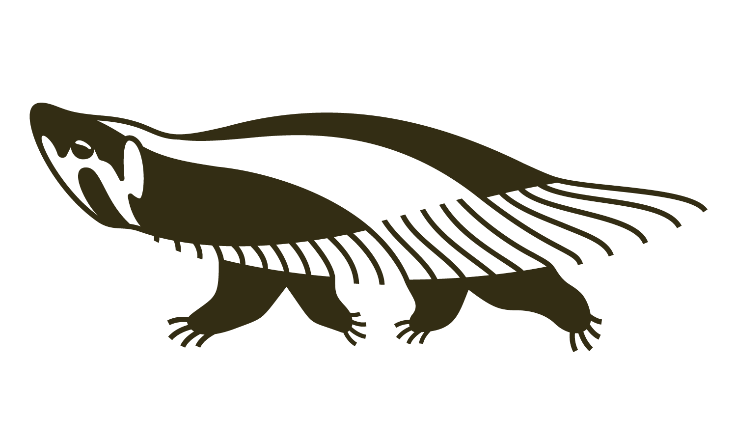

New Logo and Logotype
Creating the brand was challenging as I had to make it appear minimally influenced by colonization, as records indicate that we split from the Apache tribe around the 1600s. The logo was changed from a seal to the American badger, as seals were popularized in the mid-1700s, and the badger is an important animal in our creation myth. Additionally, the terminal and aperture of the "a"s reflect the many accented letters in our romanized alphabet.
Graphic Elements inspired from Lipan Apache Parfleche (image from The British Museum Archive)
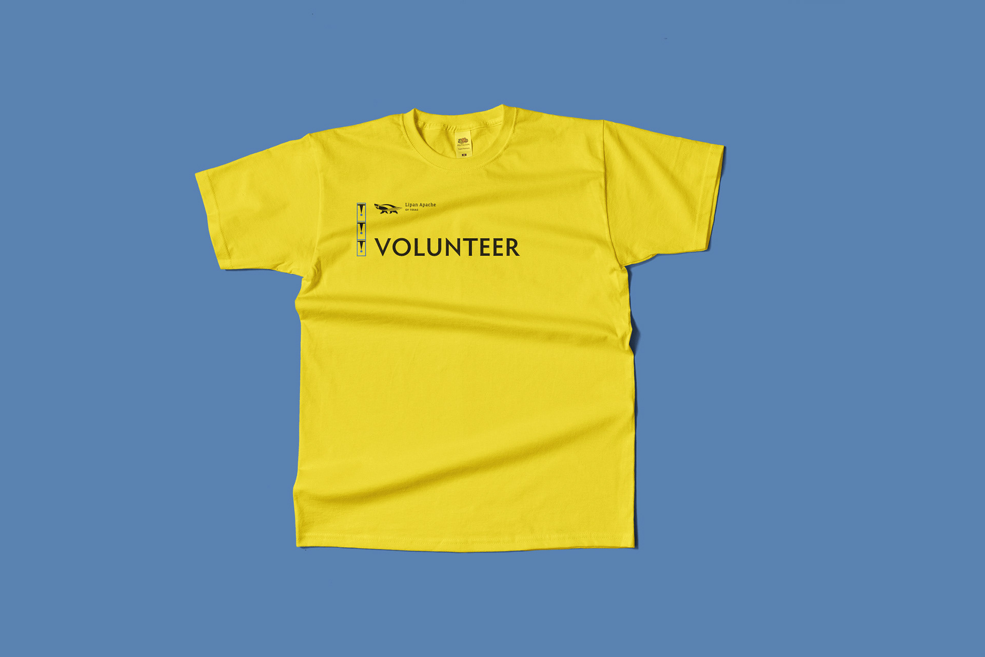
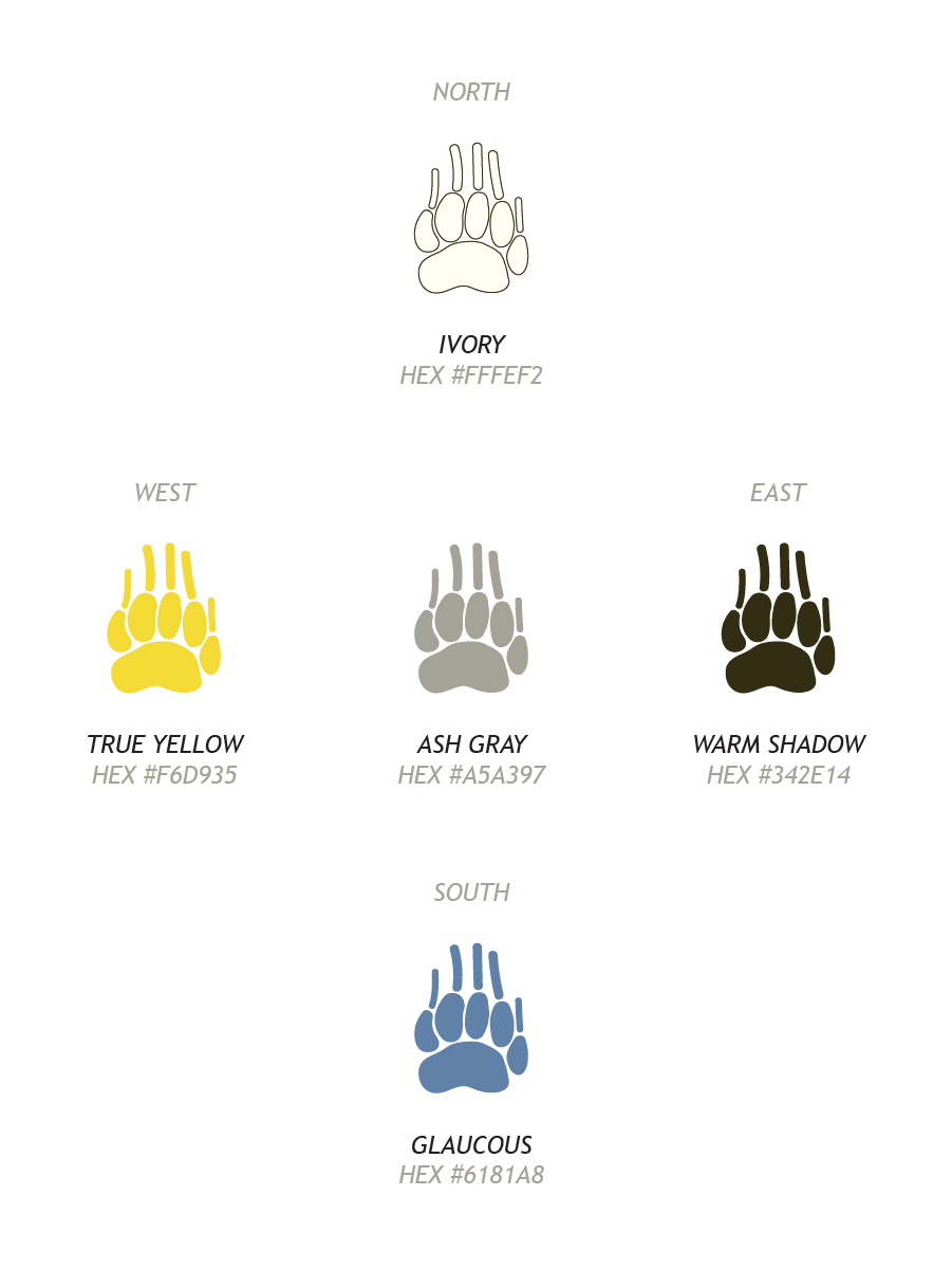
(Left to Right) Volunteer T-Shirt, Brand Color Palette
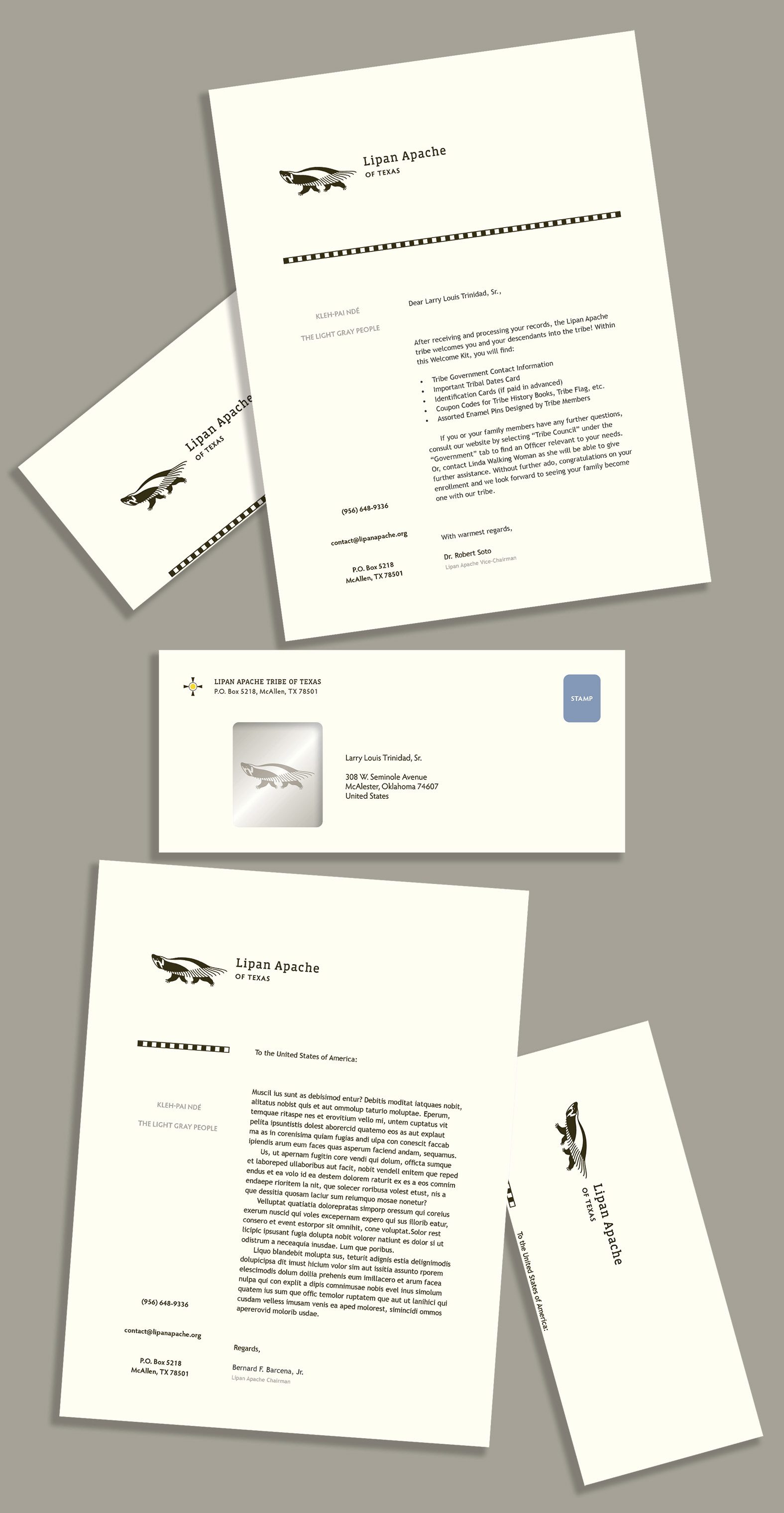
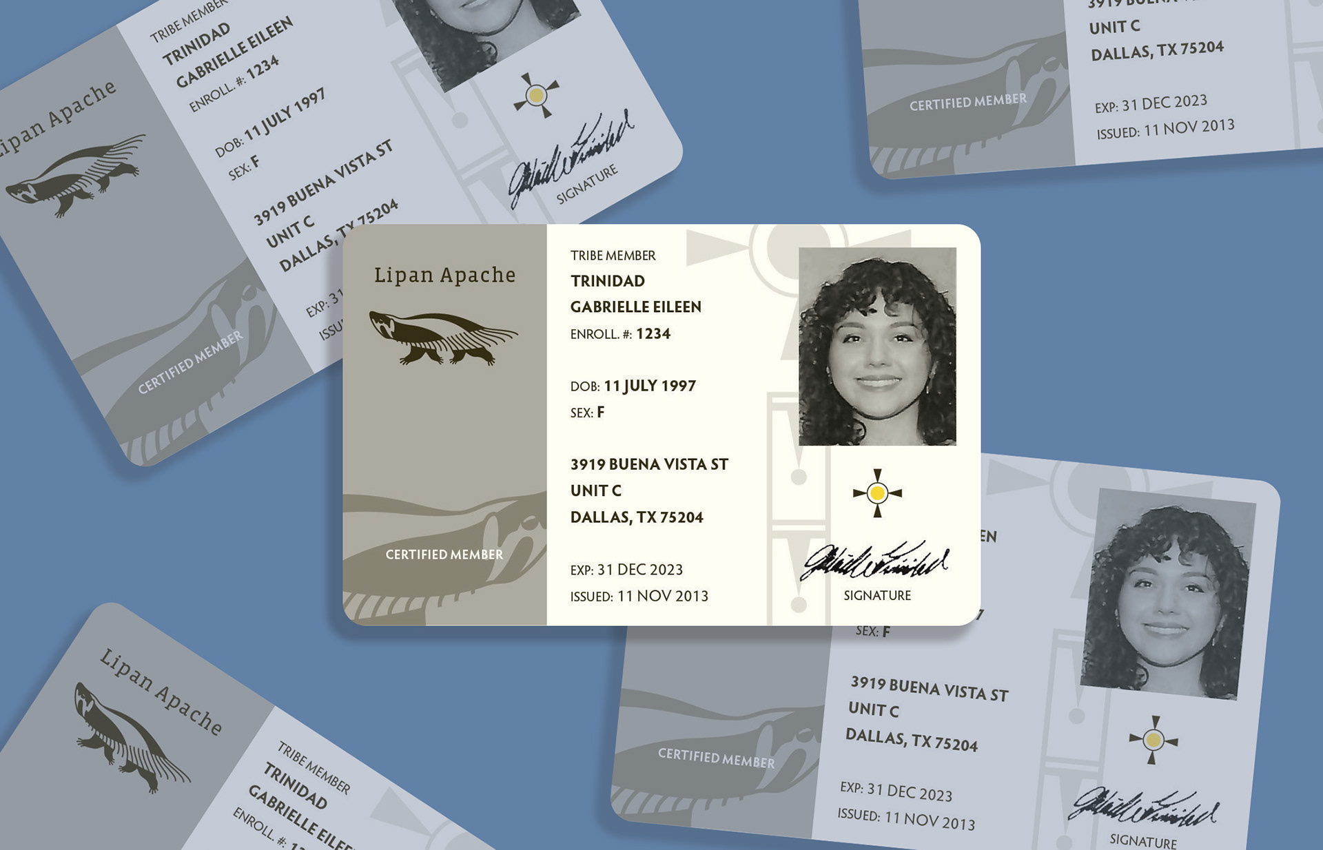
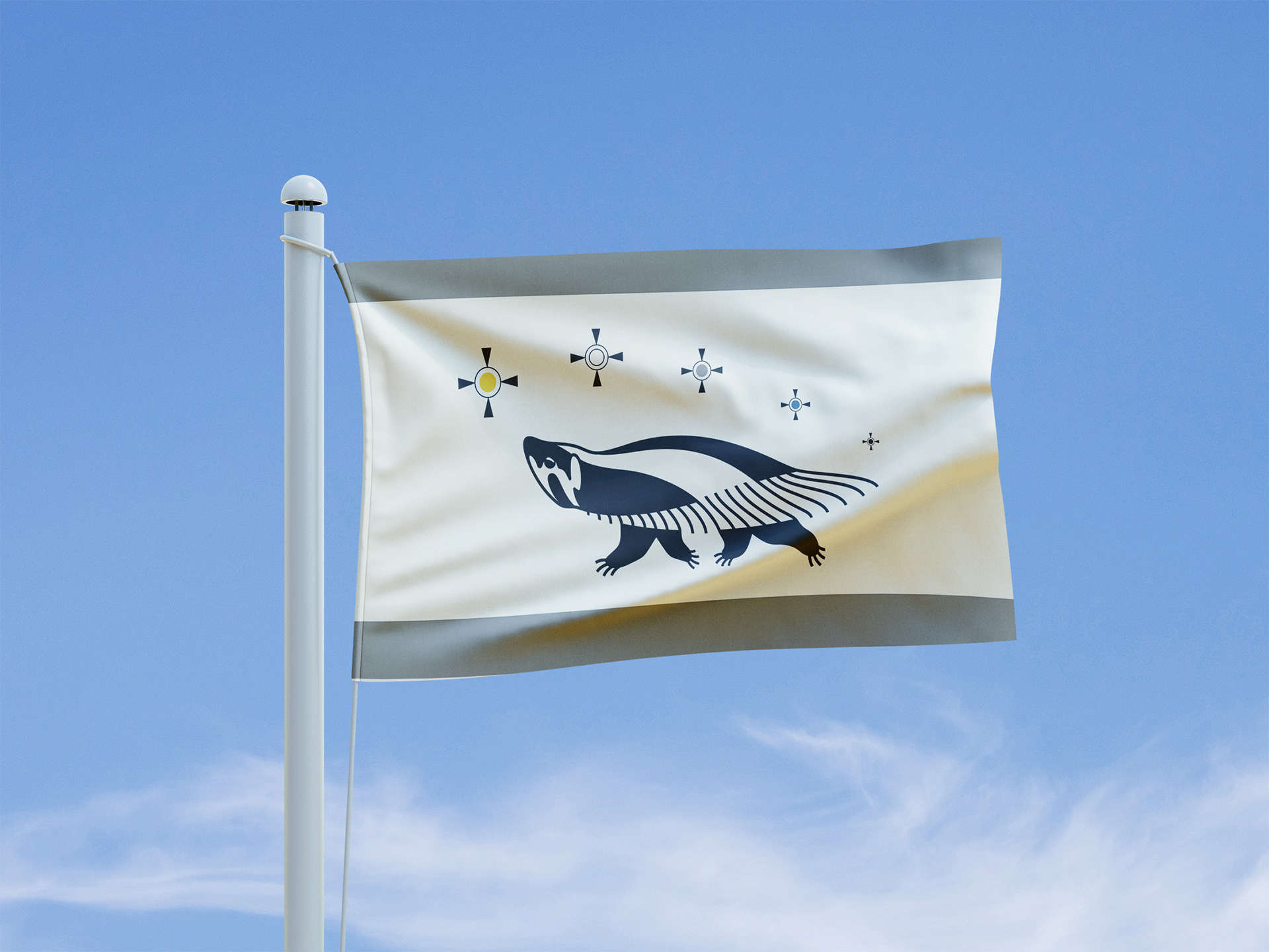
Despite how stationary is uncommon nowadays, law firms and governments still use physical mail. The asymmetrical layout adds a modern touch, and the graphic element doubles as a guide to get perfect folds for envelopes. Identification cards have somewhat complex designs to discourage counterfeits, since there are aspects of tribal religious practices that require having a member card on hand.
(Left to Right) Stationary, ID Cards, and Flag
For the tribe website, I aimed for both organization and flexibility to accommodate diverse information. Inspired by social media, I implemented a sticky navigation sidebar for easy access to other pages. Additionally, I organized information into boxes to establish a clear hierarchy.
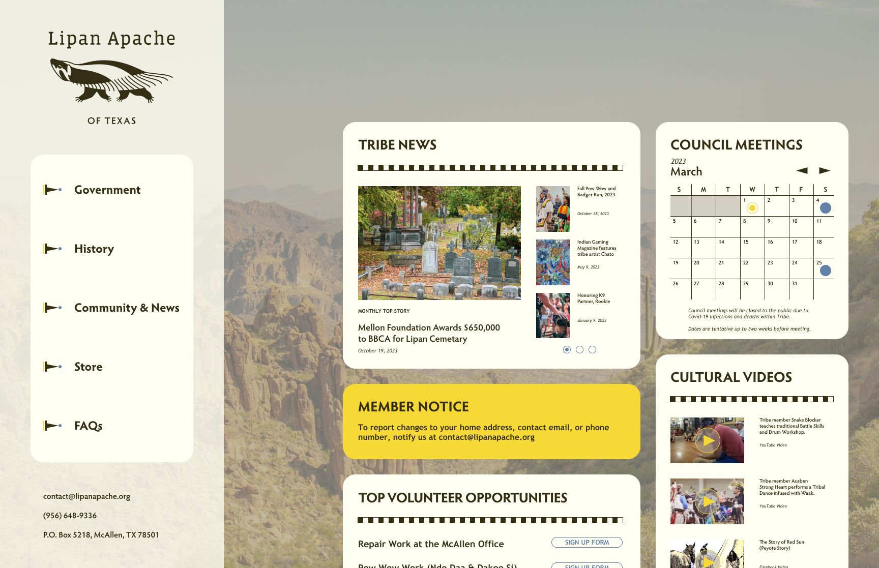
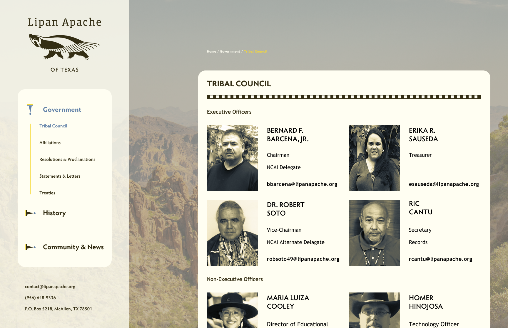
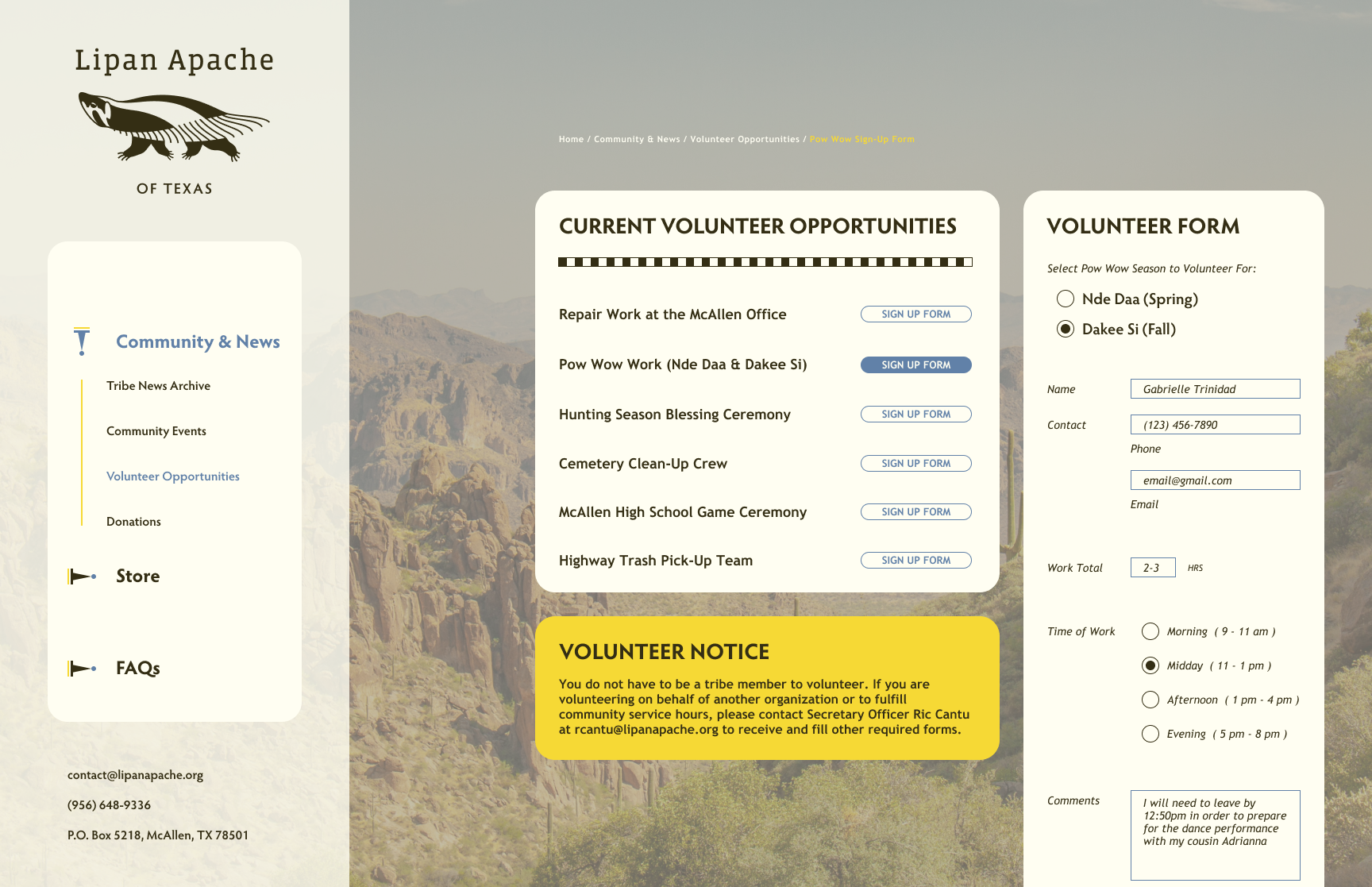
(Left to Right) Desktop website flats of Home Page, Tribal Council, and Volunteer Opportunities
