Below are examples of my work relevant to the UI / UX industry. To see these works within the full context of its project, check out the alphabetized Portfolio Log; specifically, MOTTO Font, Lipan Apache Tribe, and Blue Moon Hotel.
MOTTO Font
Mobile Web Design
Interactive Design / ADES 3510
INSTRUCTOR Whitney Holden
Fall 2022
MOTTO is a display font created by FaceType foundry, and is described as an Art Deco font in the traditions of Italian Futurismo. This font greatly reminded me of the Russian Constructivism era... as well as Miami Vice. Thus, this tongue-and-cheek site evokes the visual overlaps in communism and capitalism during the 20th century.
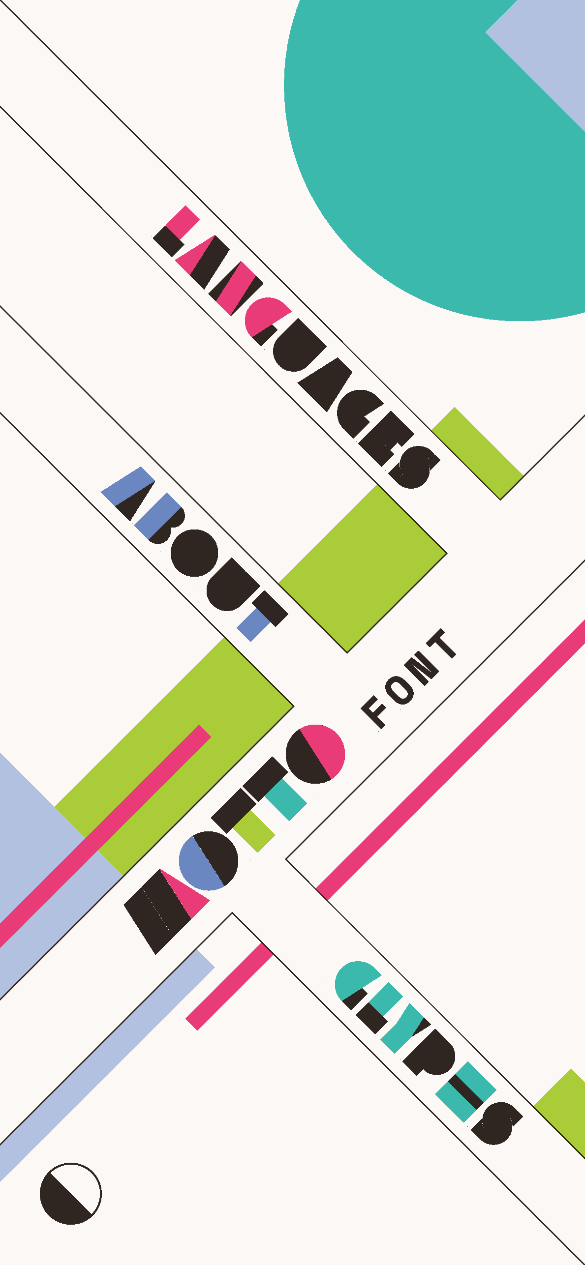
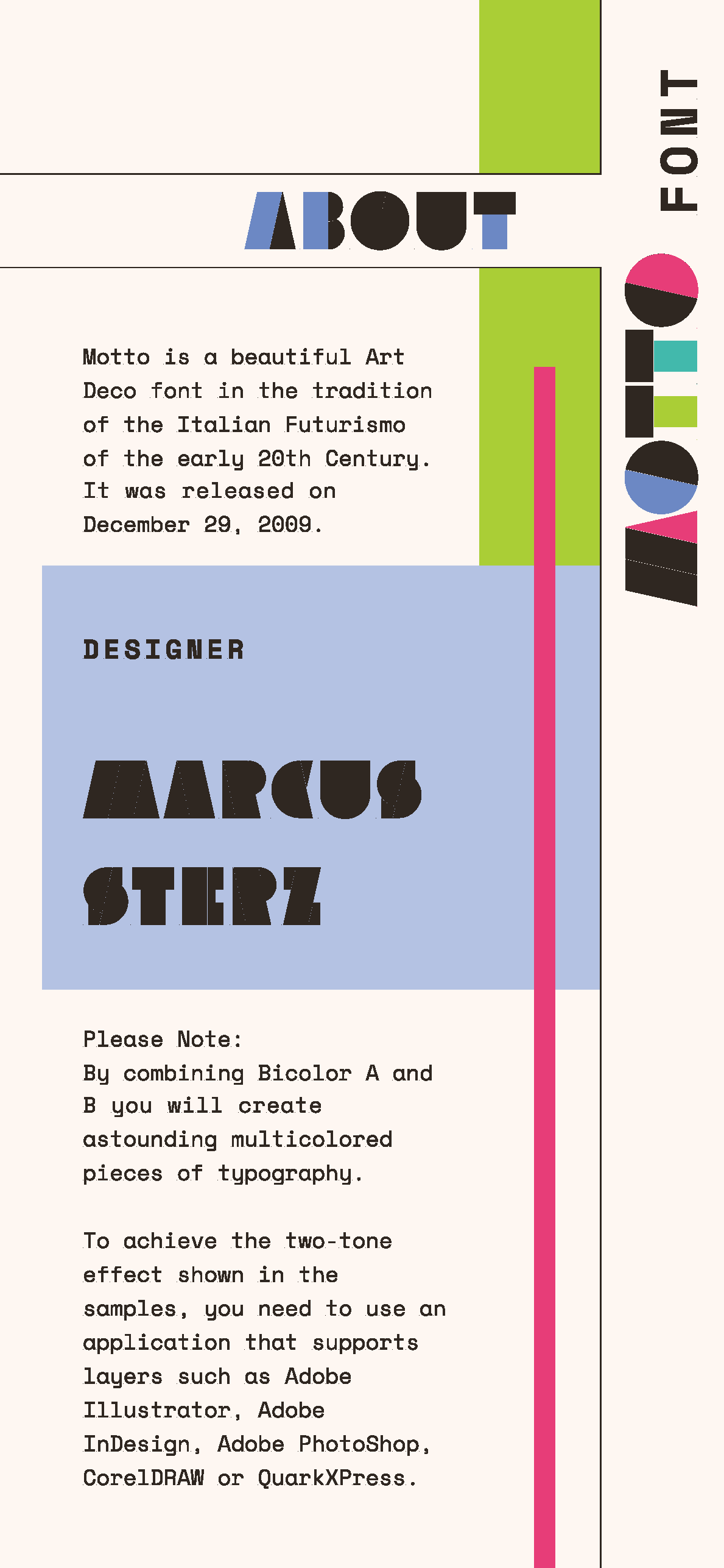
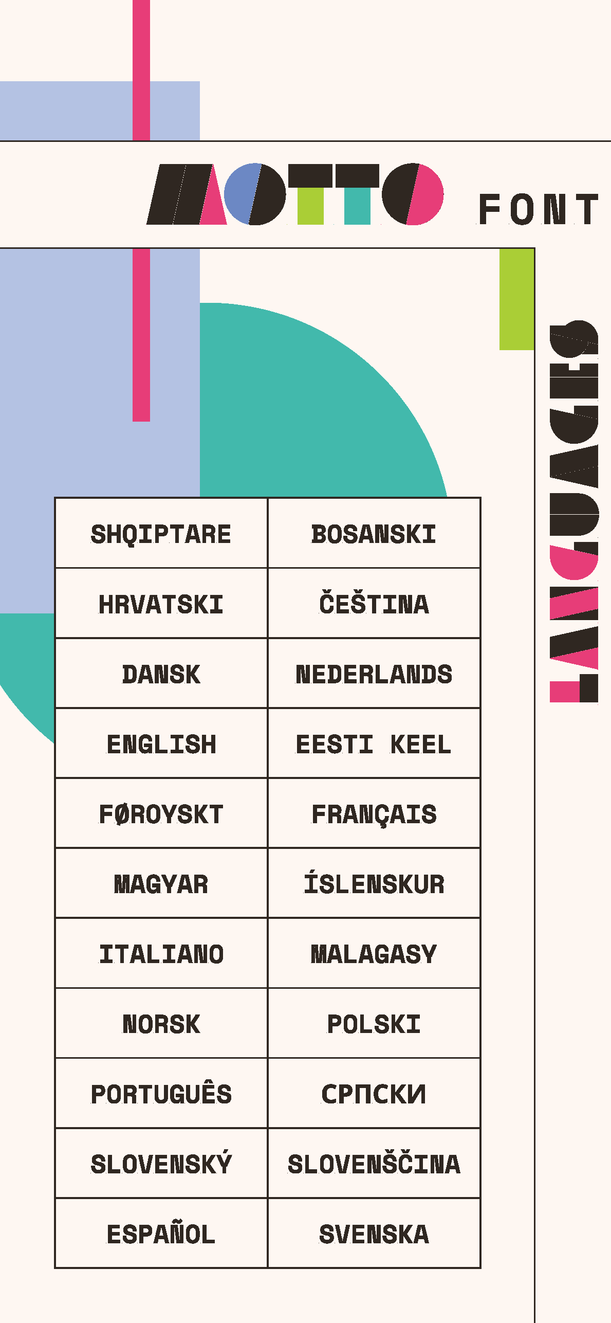

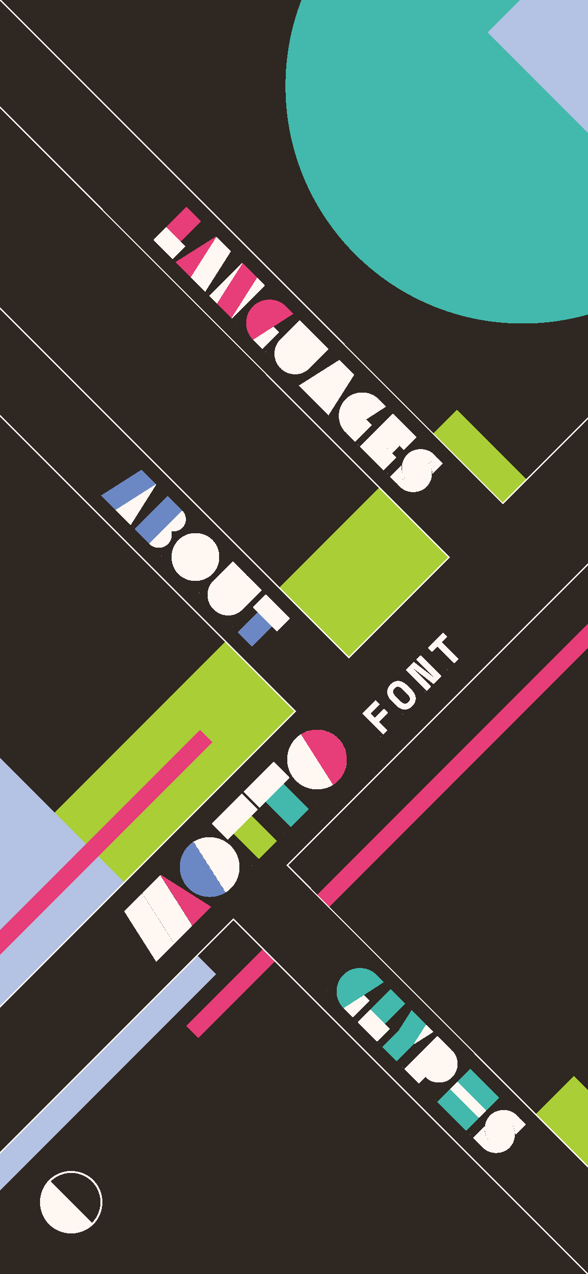
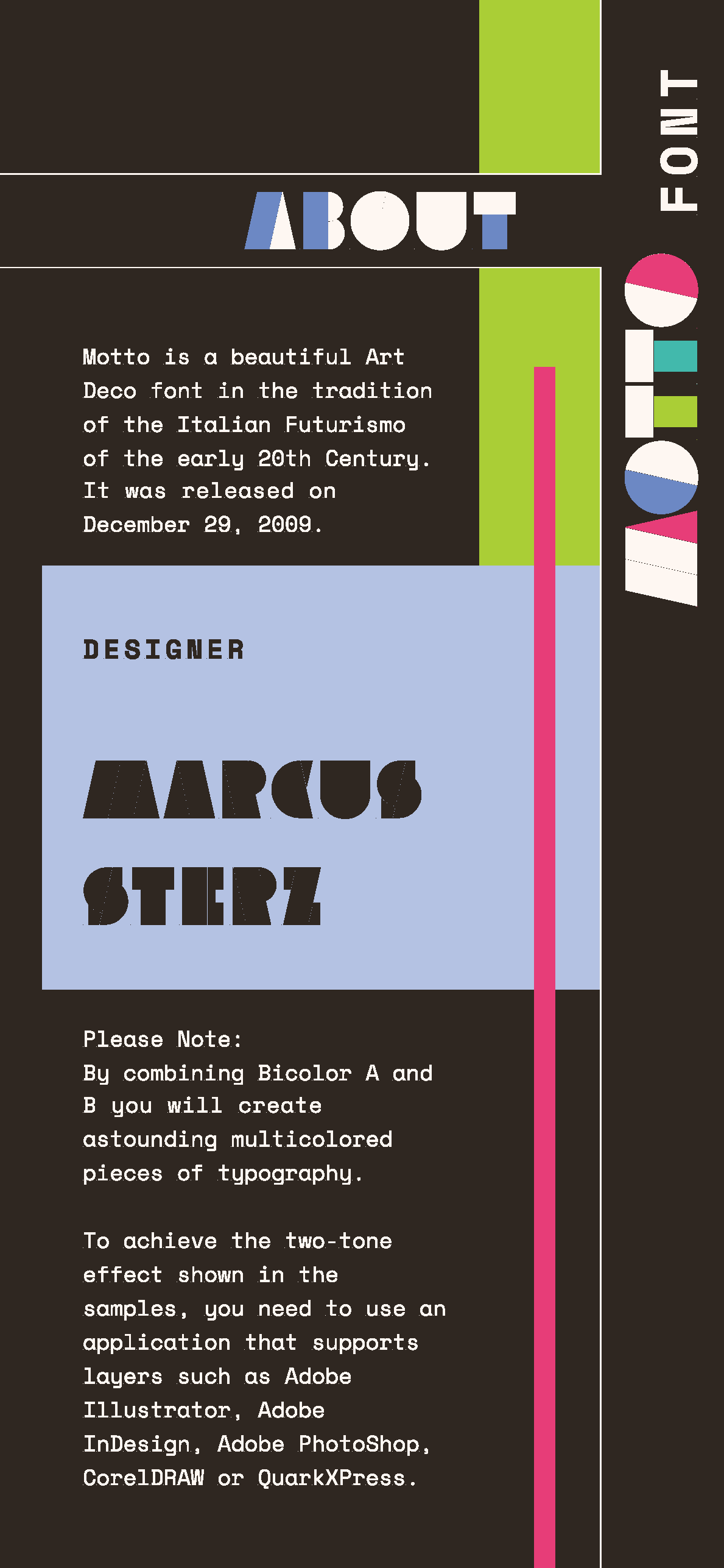
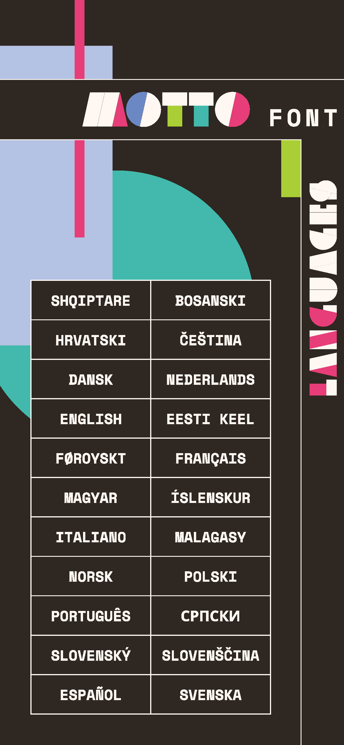

Light and Dark mode of the MOTTO Website Flats
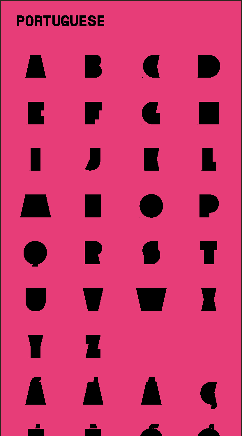
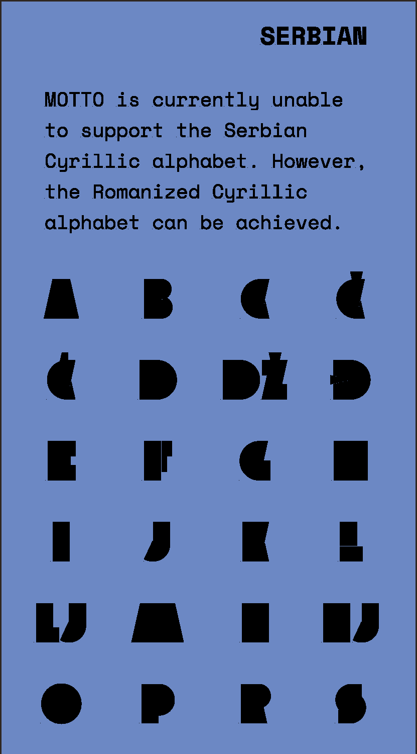
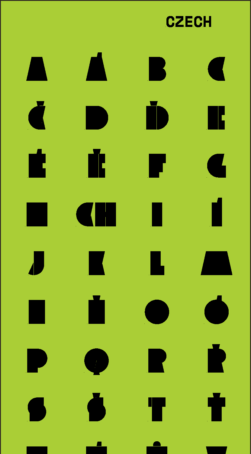
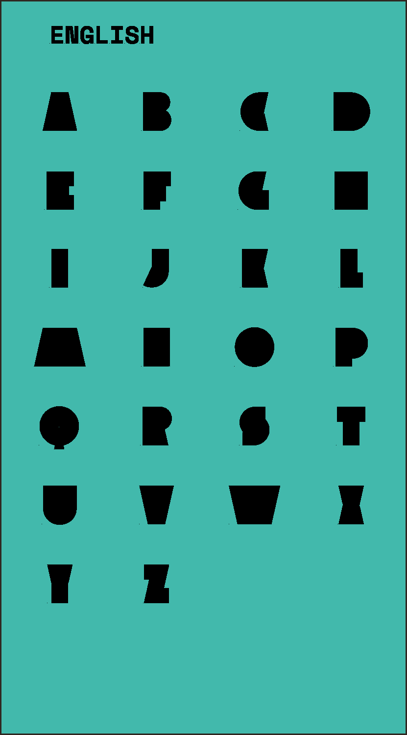

Pop-Ups of supported languages and a custom button for switching light and dark mode.
As this site was designed when I was first using Figma, there are two animations that are somewhat inaccurate in this video. If this site was properly coded, the navigation branch and shapes would move as one unit to give the feel of rotating a piece of artwork. Additionally, the light mode button would rotate when users tapped it.
At the time, Figma did not have a clear way to achieve these animations, but I was able to convey the broad-strokes of what it would look like.
Lipan Apache Tribe
Campaign
Graphic Design Advanced Campaigns / ADES 4520
INSTRUCTOR Gus Granger
Fall 2023
For this campaign I tried my hand at government design and chose the Lipan Apache, my tribe. One facet of the campaign was a redesigned website, since they still had a 1990's-era splash page. This site's challenges were sorting a wide variety of information into something easy to read, and making a government website that was actually user-friendly (even, daresay, enjoyable for the user).
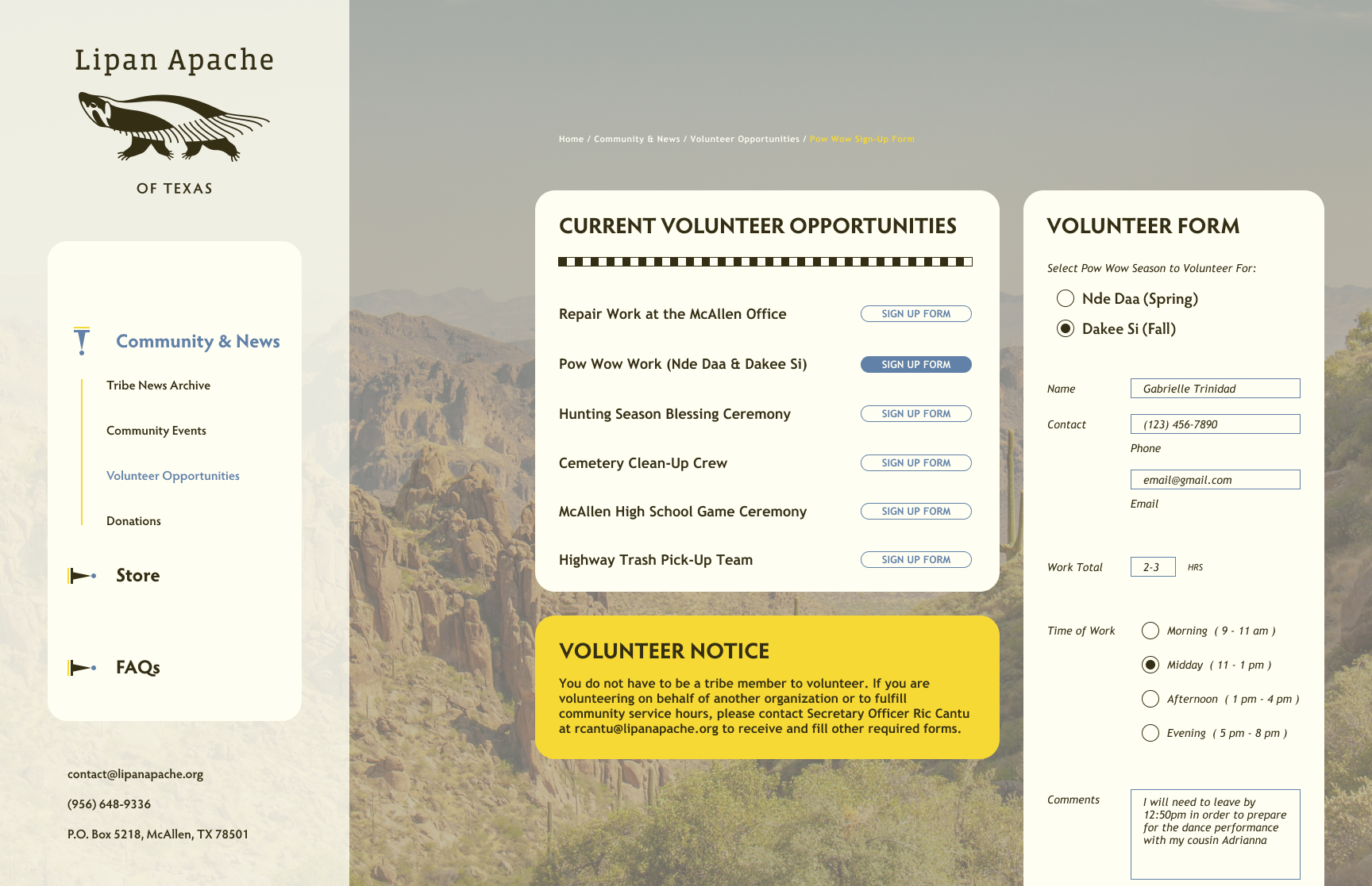
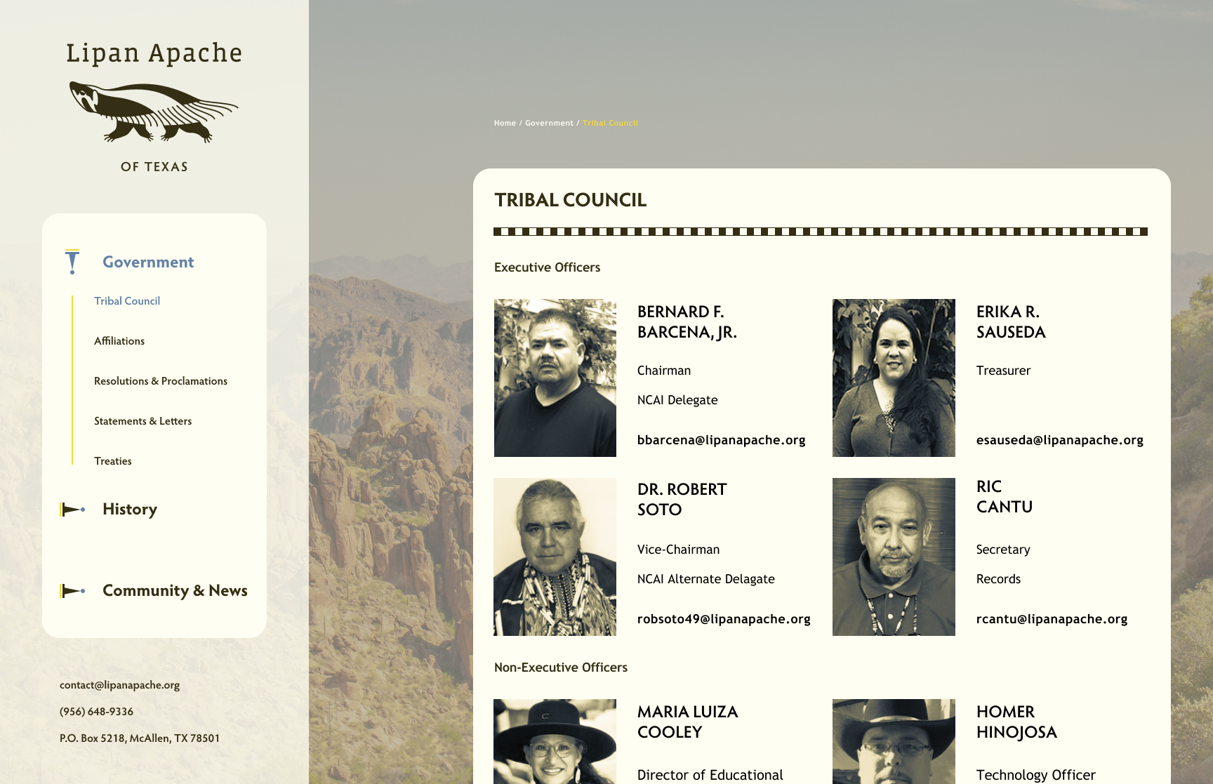
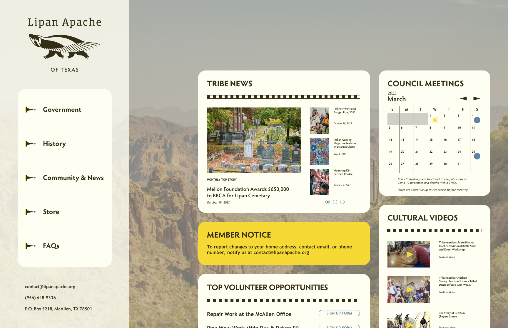
(Left to Right) Website Flats for Volunteer Form, Current Council Members, and Home Page.
This website was able to achieve its goals through its warm color palette, historically-inspired graphic elements, and a user interface that takes notes from social media websites.
Blue Moon Hotel
UX + UI Web Design, Branding
Interactive Design / ADES 3510
INSTRUCTOR Whitney Holden
Fall 2022
GROUP Emily Tran, Lauren Clark, and Max Pius
The Blue Moon Hotel was a massive undertaking as it encompassed rebranding, UI and UX design, and our first group project. We designed the hotel's desktop and mobile website, as well as a few pages for the tablet website. My primary contributions were specifically the crescent moon in the logo, amenities icons, amenities page desktop and mobile design, and the home page design at tablet size.
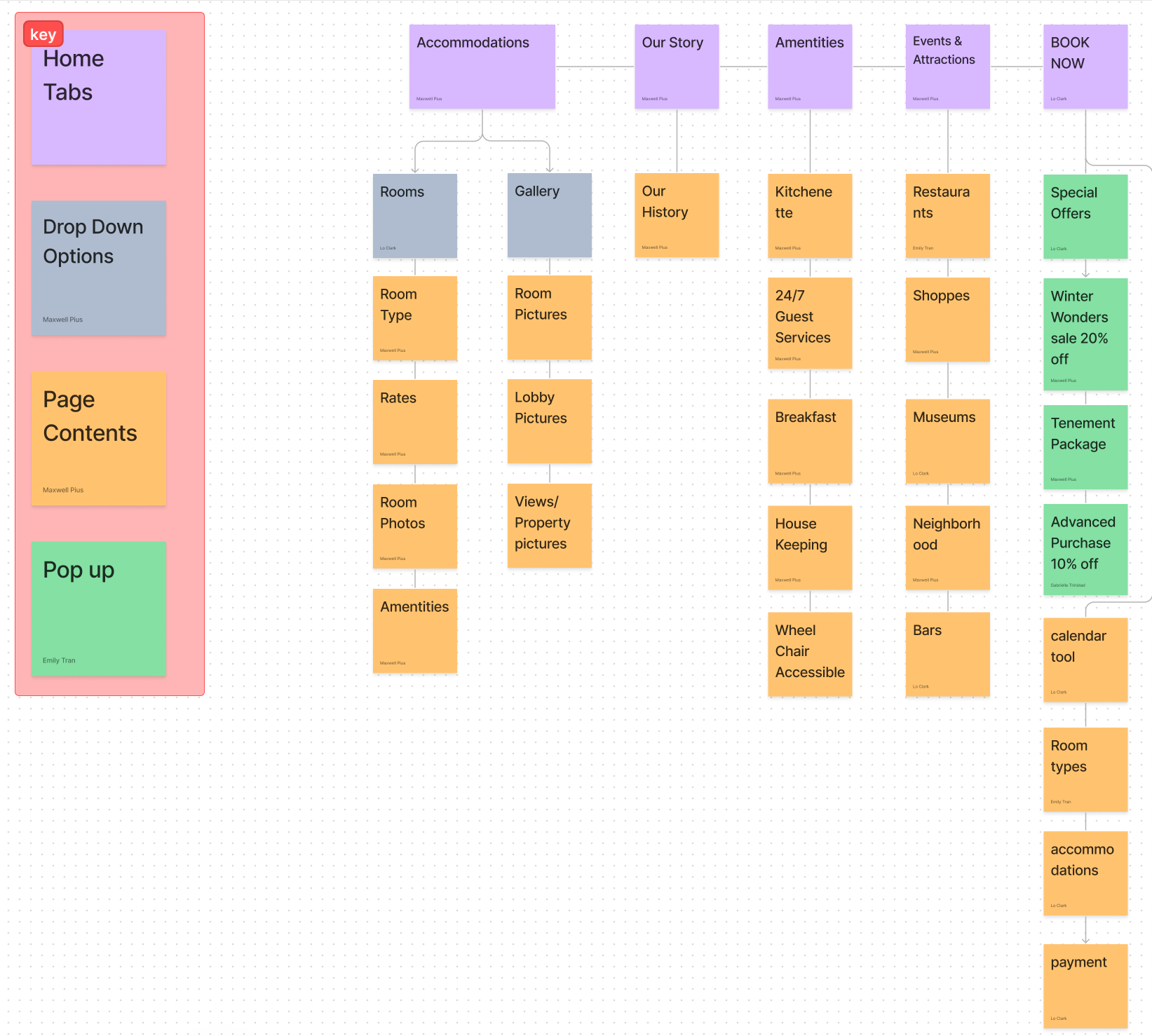
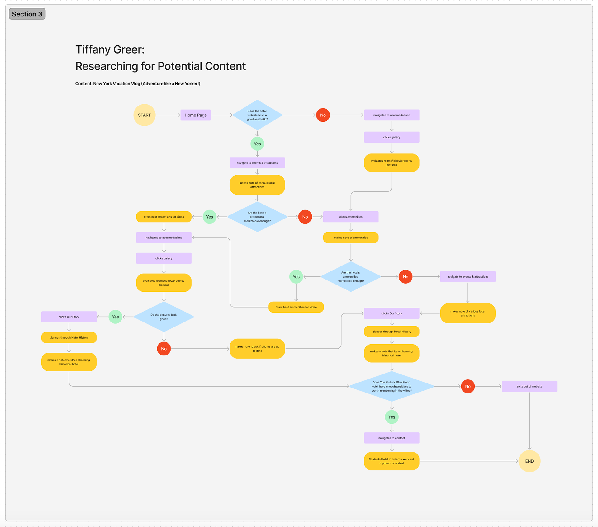
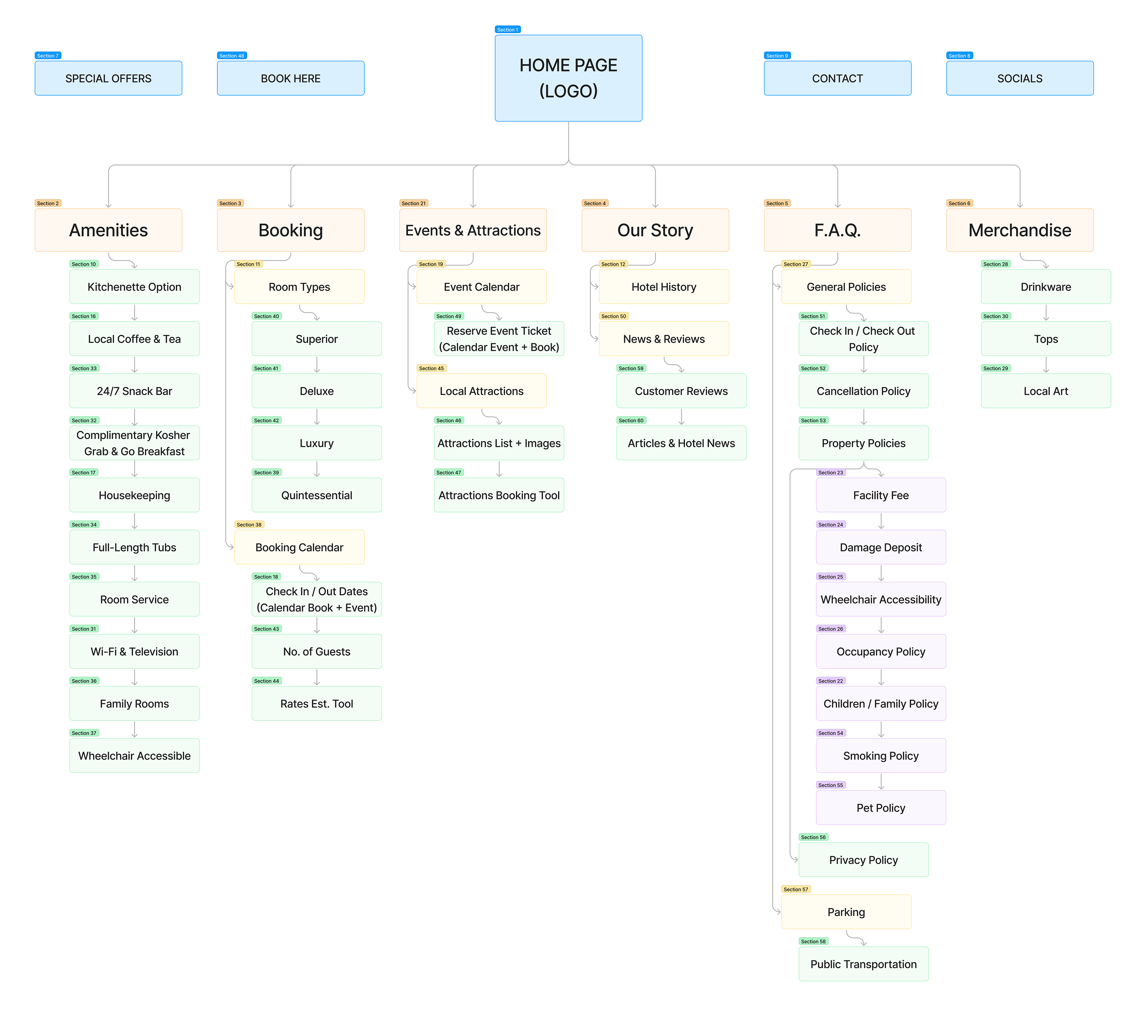
Blue Moon Landing Page Layout, User Flow Example, and Site Map
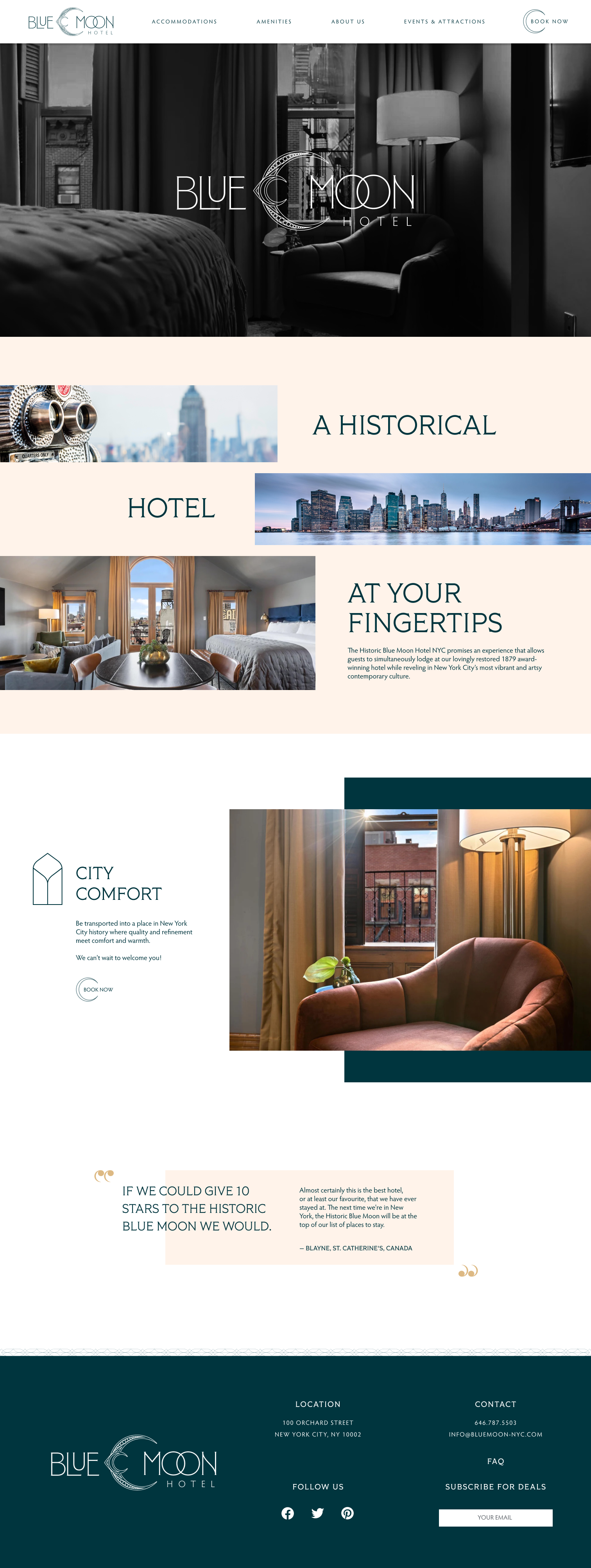


(Left to Right) Desktop, tablet, and mobile versions of the Home Page
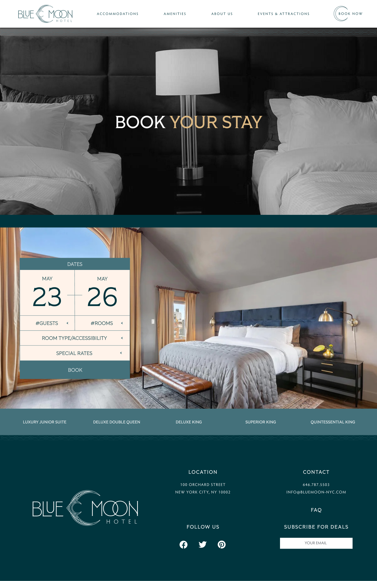


Rooms Desktop

Rooms Tablet

Rooms Mobile


Gallery Desktop

Gallery Tablet

Gallery Mobile
(Left to Right) Website flats for the Booking Tab (desktop and mobile), Rooms Tab (desktop, tablet, and mobile), Amenities Tab (desktop and mobile), and Photo Gallery (desktop, tablet, and mobile)
For the Blue Moon Hotel, my group aimed to convey the hotel's affordable luxury and modernized historical interior. This is achieved through the brand's new aesthetic and modern site layout. We also enhanced the website by adding a feature for booking rooms and an events tab that functions as a digital concierge.


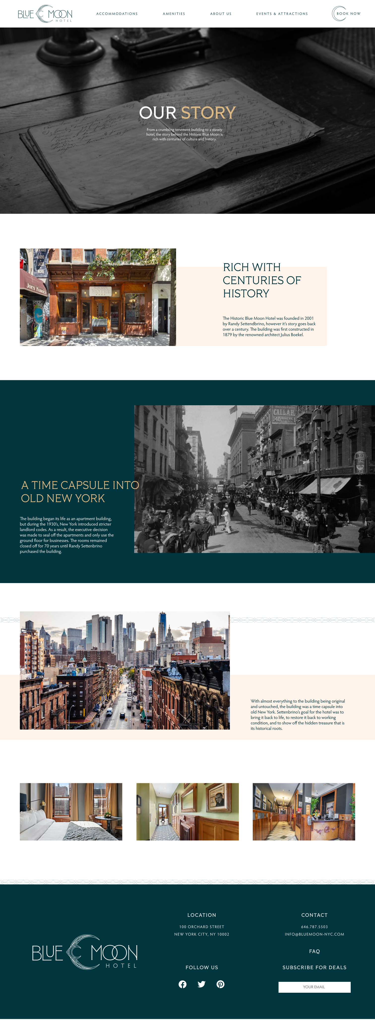


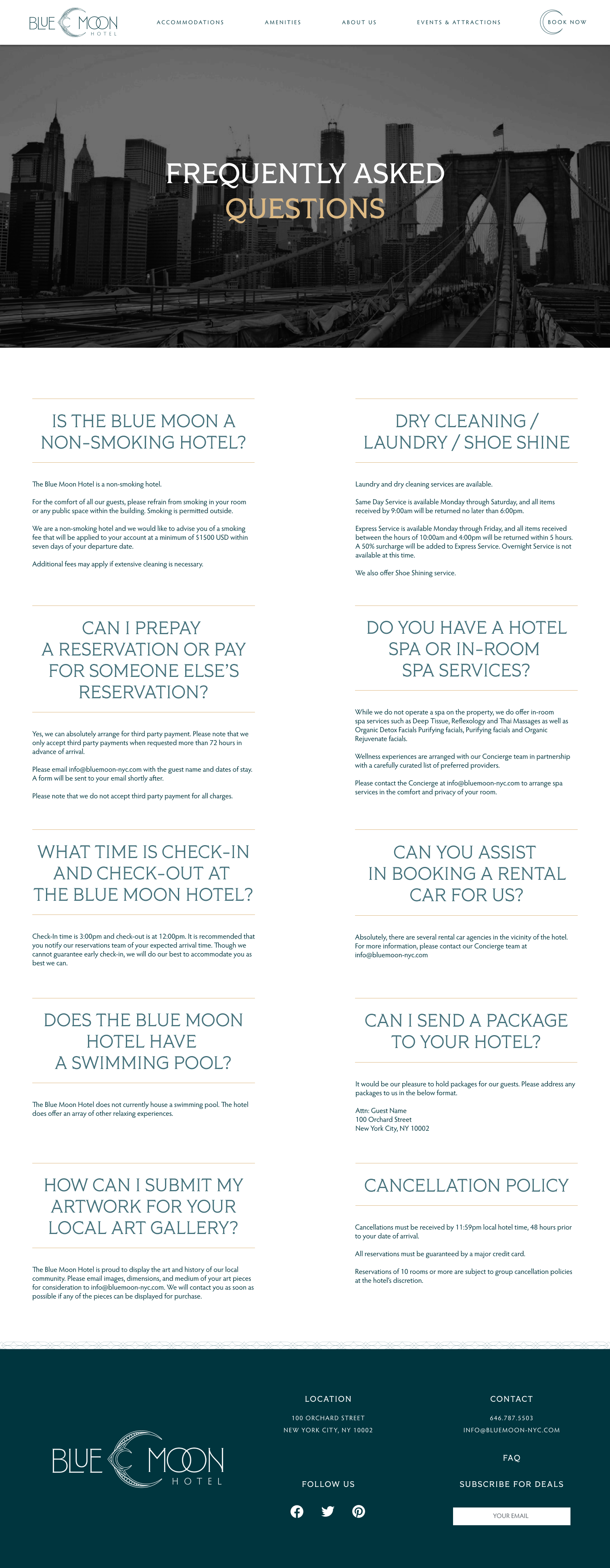

(Left to Right) Events Tab (desktop and mobile), Story Tab (desktop, tablet, and mobile), and FAQ (desktop and mobile)
